Magnifica event planning is a premium event management company based in Dubai, UAE offering a range of services including wedding planning, private parties, and corporate events.
The Challenge
The design brief had a quite clear formulation. The client needed an expensive-looking logo that would be luxurious, elegant, and have a wide range of applications at the same time. They had already seen one of our company’s works and wanted to get a similar logo. The client also mentioned some desirable characteristics to include in the logo design: the effect of gold coating, dark jade green tones, and textures. Given the specifics of the industry and the client’s desires to convey “luxury”, we needed to design a logo that would also be elegant and delicate.
SOLUTION
This is how the final logo looks like.


WORK PROCESS
1. Having received the brief from the client, we immediately clarified several important points, agreed on the terms, and started the logo development process.
2. During the first stage we developed 7 concepts with visualization and a detailed explanation of each concept. At this stage, the choice was already made in favor of more decorative fonts, but the client decided to change the emblem to make it more detailed and complex.


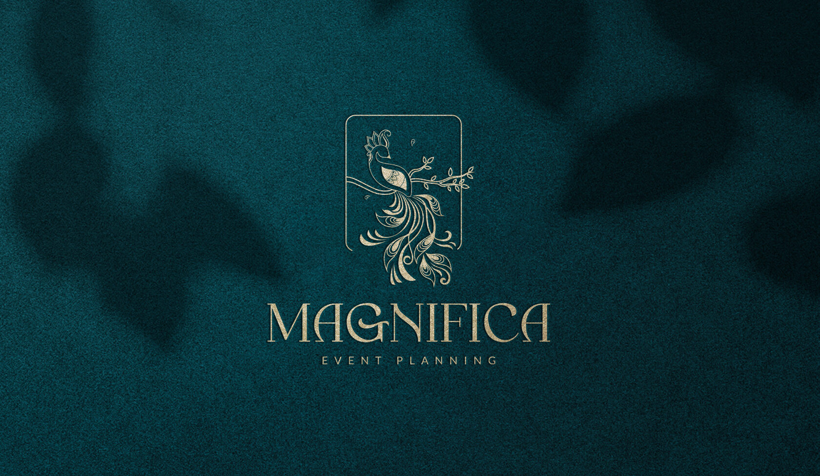
The approved logo consists of an emblem, company name and an additional (secondary) text explaining what the company does. The emblem depicts a peacock sitting on a branch. For hundreds of years the peacock has been famous for its beauty and symbolism. The image of this bird, full of majesty, strength and charisma, is used in numerous mythological stories and tales, symbolizing divinity, royalty, honor, and sometimes immortality. Peacocks have always been considered royal birds. In ancient times, only kings and their elite guests could enjoy watching the peacock dance. This bird combines elegance and luxury and is best suited to show a high level. Strong yet elegant, luxurious yet delicate, the logo combined natural shapes and elements rich in textures and is in line with the positioning and the vision of the company.
The logo is also used as:
- An emblem only
- Wordmark only
- Logo without its secondary text

6. All the design files were sent to the client in an organizes way and presented in the brand book.
7. The cooperation went on and the client also offered to work on their website project and design posts for social media.
Outcome
Throughout the design process we have designed more than 10 logos. The development and the exporting of the logo files along with two revision rounds took about two weeks, and another 2 weeks were required for the development and editing of the brand assets. We successfully completed the project which resulted in a long-term cooperation with the client.